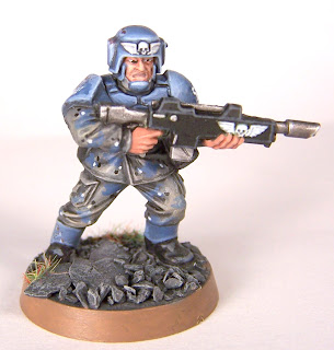
Since my last update, I've plodded along with my veterans squad. The progress is slow, but satisfying so I don't see my pace changing too much. I've only got one more model left to paint to complete the squad, so I'm looking forward to meeting that milestone very soon. Most likely I'll finish him today.
I want to talk about that model at the top for a moment. While I've continued to work on my smoothed highlighting style, I've also been working on the wear-and-tear effects I've been employing. First off, I save them until the very end of the painting process. I basically want the chips and dings to be the last step. It gives me time to feel out the model while I'm painting it, and come up with some ideas of how I want to express the damage to that particular character's armor. The second step is making my dark scratch, chip, or ding marks. I used either a sponge dabbed in a mixture of Scorched Brown and Chaos Black (about a 60/40 mix), dab off excess and then press a small portion of the sponge to a chosen spot on the model. I use the same technique with Shadow Grey and dab that over the white decals to make them look a bit chipped as well. Alternatively I'll use a very fine brush and free-hand some scratches or circular "dings."
With that done, the most important part of the process is to properly highlight these marks. You really do most of the work during this part. Your goal should be to express a depth or the severity of the damage through the use of shallow or deep highlights. What does that mean? Well shallow means less highlighting, but possibly sharper, narrow highlights. Deep damages have larger "halos" of highlighting. Don't be afraid to exaggerate it.
I had been using the GW 'Eavy Metal technique of using a little silver metallic inside of these marks, but it seems to take away from the marks and lessens their visual impact. If I was using a darker blue (or should I say "deeper" blue... whatever) the silver flecks would show up a bit better. As it stands, the contrast of the lighter blues with the darker scratches looks pretty solid.
I am a real cheap skate when it comes to this hobby, so I'm always making an effort to get as much as I can out of my hobby dollar. To that end, I am repainting my original test models of my Guard army. I've completed my first repaint, and here are the results:
I think we can all agree that it's a pretty nice change. Granted it probably takes me twice as long (at LEAST) to paint the newer version. The added benefit of repainting my first two test models, as well as completing the other three from that little 5 man Cadian box, is that I'll have some extra models to use for whatever converting purposes I can conceive.
So Dark Eldar... AWESOME! Those are some great looking models. I'm really looking forward to seeing some of the rules and ideas they have for the army. Seems to me that 40K has been in desperate need of "cool" bad guys. The Chaos stuff is just a little too "try-hard" for my tastes. Too many spikes and exaggerated "evil" looking stuff that ends up looking like an 80's metal album cover. To many, that's a good thing, and hey buddy, that's fine. But this new look for Dark Eldar is just slick. While maintaining a very organic look to tie them in with Eldar, they've given them an edge that really just pops. Sure there are models with horns, and in limited quantities, that's fine. This release comes at a good time, as I've been looking over the
Killzone: Spec Ops rules. This has inspired me, once again, to look at those low points, skirmish type game. I don't know if I'd want an entire Dark Eldar army just yet, but I'd LOVE to paint some of those models. If I can find any excuse to play them on a table, game on!
I'll wrap this up now with a few pics of my completed models:
Hope you enjoyed! Comments, tips, or critiques are appreciated!


2 comments:
very interesting. Hmmm.
You need to update, Sam! I know you've been painting more. . . .
Post a Comment